The other day I was adding a delete action for an application. I added the standard red button and was just about to implement the default confirmation dialog (“Are you sure you want to delete this item? OK / Cancel”) before realizing how dialogs in general annoy me.
The problem, as I see it, is that there is somewhat of a context switch. You leave the application and are sent to Dialog Land. Admittedly, you seldom stay long in Dialog Land, but you are broken out of your current flow. It can be argued that this is the point, since this break of context means the user is forced to consider if they really do want the go through with the action. We should of course do this in the case of irreversible actions, but is a modal dialog really the only way?
My idea was to keep the user in the same place visually by simply replacing the action button with a confirmation button on click, requiring an additional click to go through with the action.
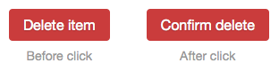
There are two problems with this. First of all, the user might not even notice that something has changed. The buttons still have the same colors and are about the same size, so there is not enough of a visual cue that another action is required. Secondly, the immediate switch means that an involuntary double click will lead to a confirmation.
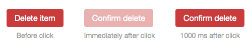
The second point is easily solved by adding a delay before the action can actually be confirmed. A few hundred milliseconds is enough for that. We can however use this time to also visually indicate that something has happened by changing the text and indicating that the button is inactive. To make sure the user has time to realize this, the delay needs to be at the very least half a second, and I personally found around one second to be a decent trade-off between usability and user safety.
The remaining problem as I see it is that a user who is 100% sure that they want to perform this action is forced to wait. Especially if they are performing this action repeatedly, it will get annoying pretty quickly.
One idea, which I haven’t implemented yet, is allowing the user to bypass the confirmation step by holding Command/Control while clicking the button. The risk however is that this forms a behavior with the users where they always perform actions this way, effectively removing the safety net.
As always, I’d love some input. Is this over-engineering for a problem which already has a solid and accepted UI pattern? Is it reasonable to allow a user to bypass confirmation of dangerous actions? Lets hear it in the comments.
EDIT: I posted a Gist containing a sample implementation of this confirmation button in Javascript and React.